 Console
200+ services
Console
200+ services
Navigation
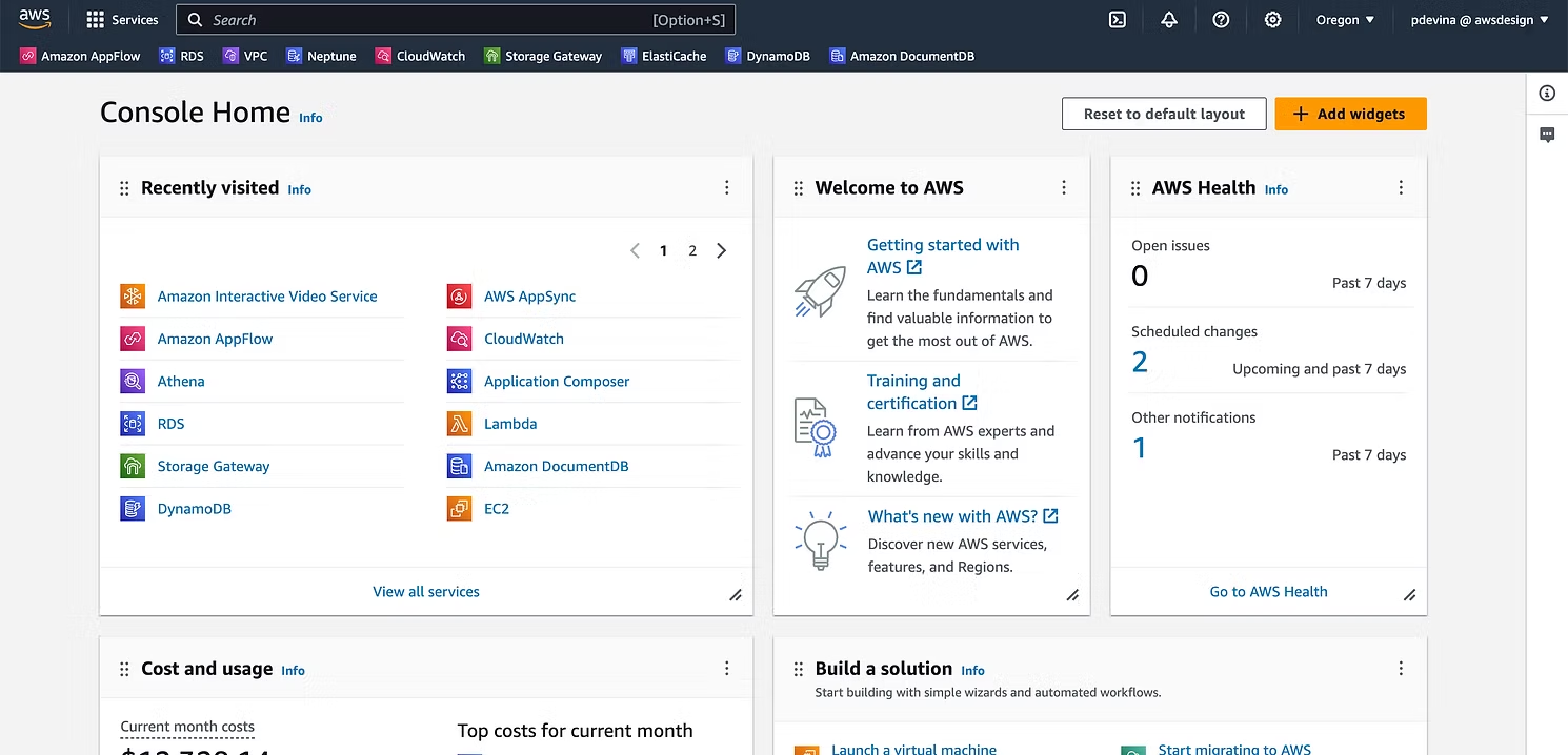
Rebuilt the AWS global header, the primary way millions of customers reach any of 200+ services, clearing ten years of UX debt and lifting favoriting discoverability by 55%.
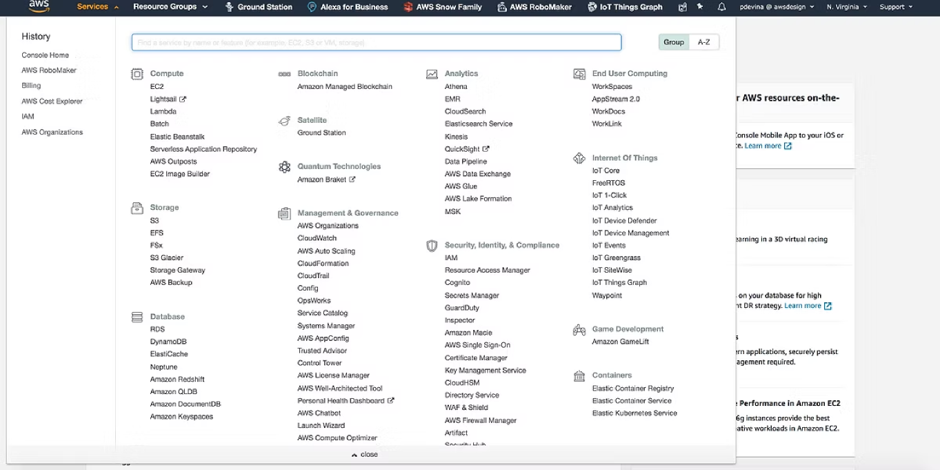
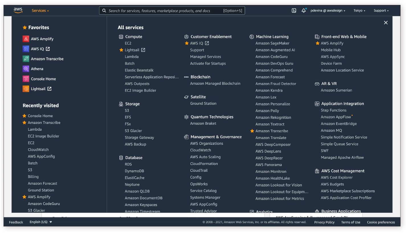
A navigation bar used by millions every day.
The AWS global header is the primary way customers navigate to any of 200+ services on the AWS Console.
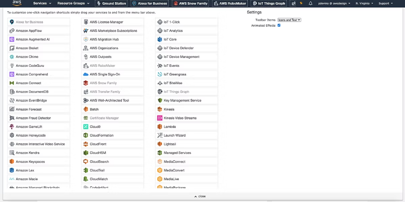
10 years of UX debt
{{ d.body }}
Four archetypes, mapped by ease of use against technical capability.
The global header serves everyone who touches the Console, but they arrive with very different needs. We plotted four archetypes against ease of use and technical capability to decide who the navigation had to serve first. Decision makers and IT admins live in the Console UI and depend on scanning and favoriting to reach services quickly; ML engineers move between the Console and BI tools; application developers largely bypass the header for the CLI and CloudFormation. That spread is why V1 prioritized scannability, favoriting and responsiveness over deeper account and region controls. The low to mid technical roles had the most to gain, and the most to lose from nine years of accumulated UX debt.

Lowest technical capability — needs the easiest path in.

The core console user; navigates services directly every day.

Mid-range on both axes; moves between console and analysis.

Highest technical capability — automates rather than clicks.
What customers were asking for — and what made V1.
- {{ a.num }} {{ a.name }} {{ a.status }} {{ a.why }}
Three goals
Defined jointly with the Product Manager after research synthesis, then presented and iterated with engineering and product leads.
Cross-destination consistency
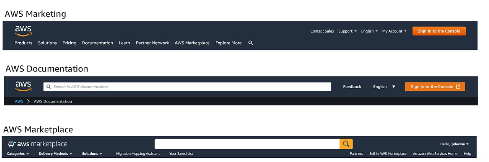
Investigated how other AWS destinations handle navigation so the header could present a consistent experience across the entire AWS ecosystem.
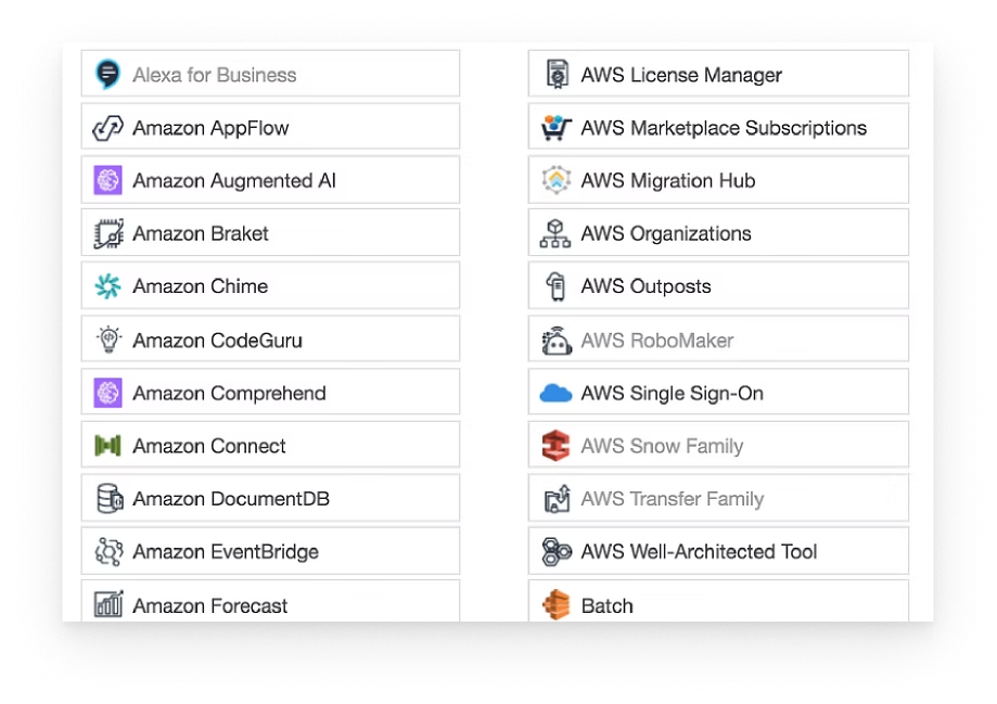
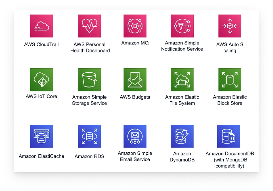
A single icon system for 200+ services
Explorations
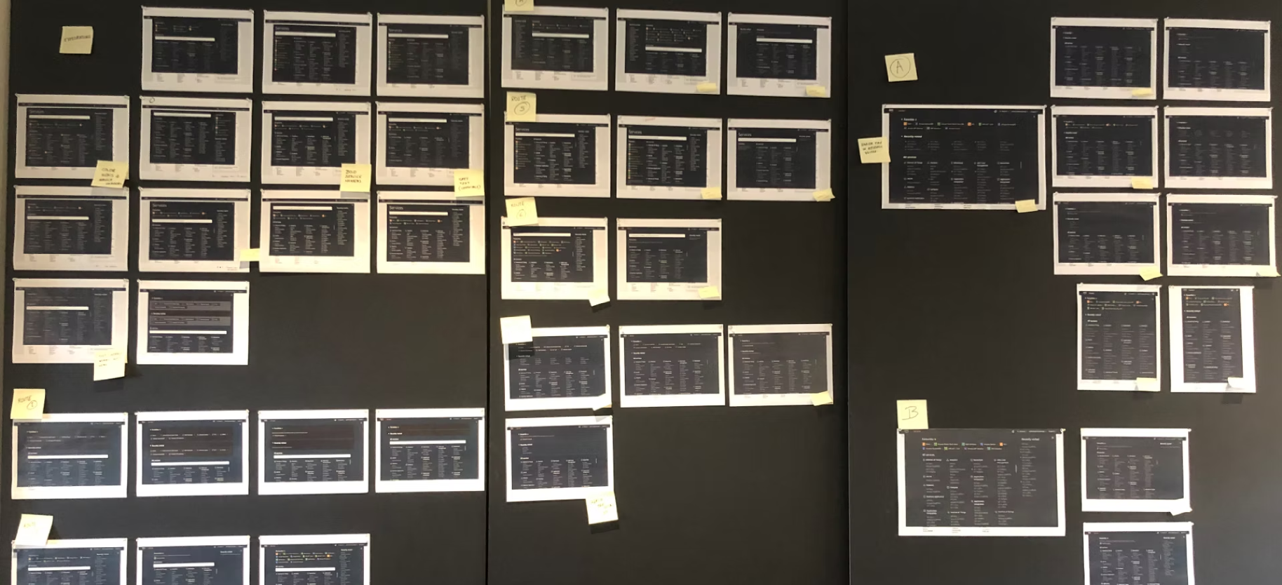
Concepts printed out and pinned up to review with the VP of Product and Head of Design.
Comparing concepts
Scored each concept against scale, scannability, access, scrolling, placement, visual design and downstream impact on the global header. Concept 1 won on access with its one-click favoriting, but capped at five services and hid the service names. Concept 2 scaled further, yet scanning was hard and its treatment clashed with the content below. Concept 3 was the only one strong across every criterion. It scales to full page height, scans cleanly top to bottom, stays visually balanced in a single column, and frees navigation real estate for later features, so it went forward to usability testing.
Usability study
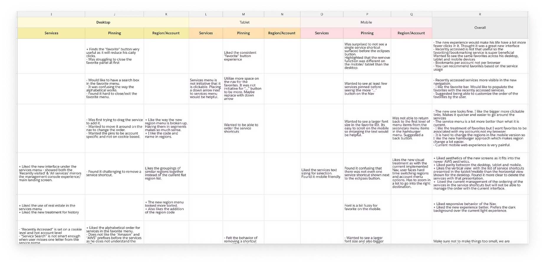
Tested the selected direction with 12 customers, then took the findings into implementation with engineering.
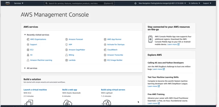
Redlined every state for engineering.
Handed off spacing and sizing on one pass and type, color and component references on the other, pointing back to Polaris for the modal and button rather than respecifying them.

Pin a service, reach it anywhere
Impact
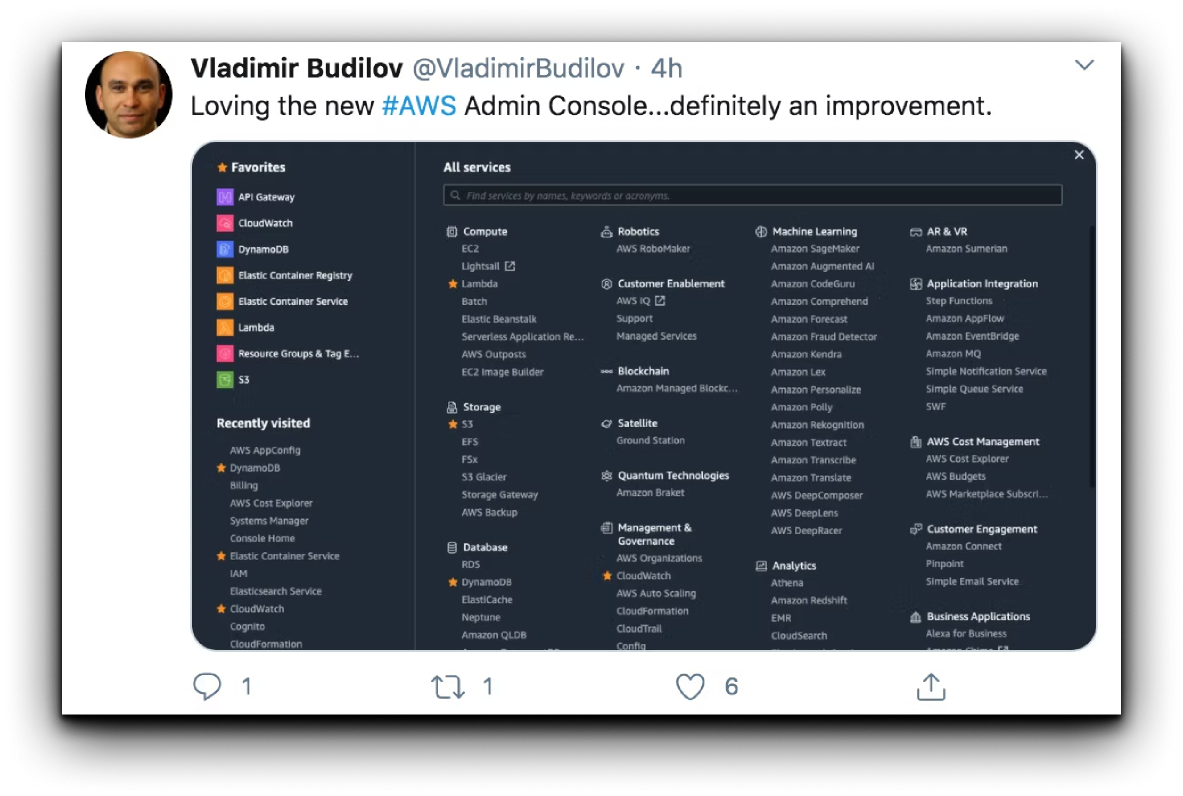
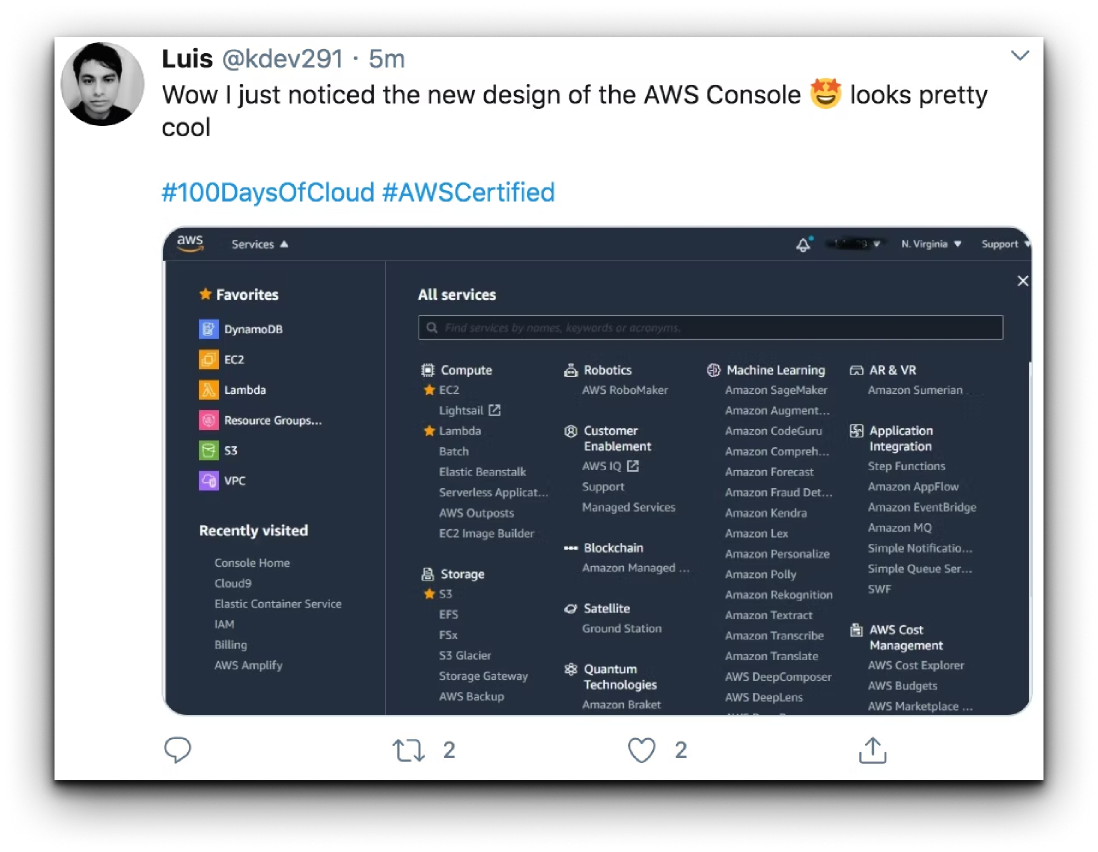
“We did it! Discoverability of favoriting a service increased by 55% post launch.”
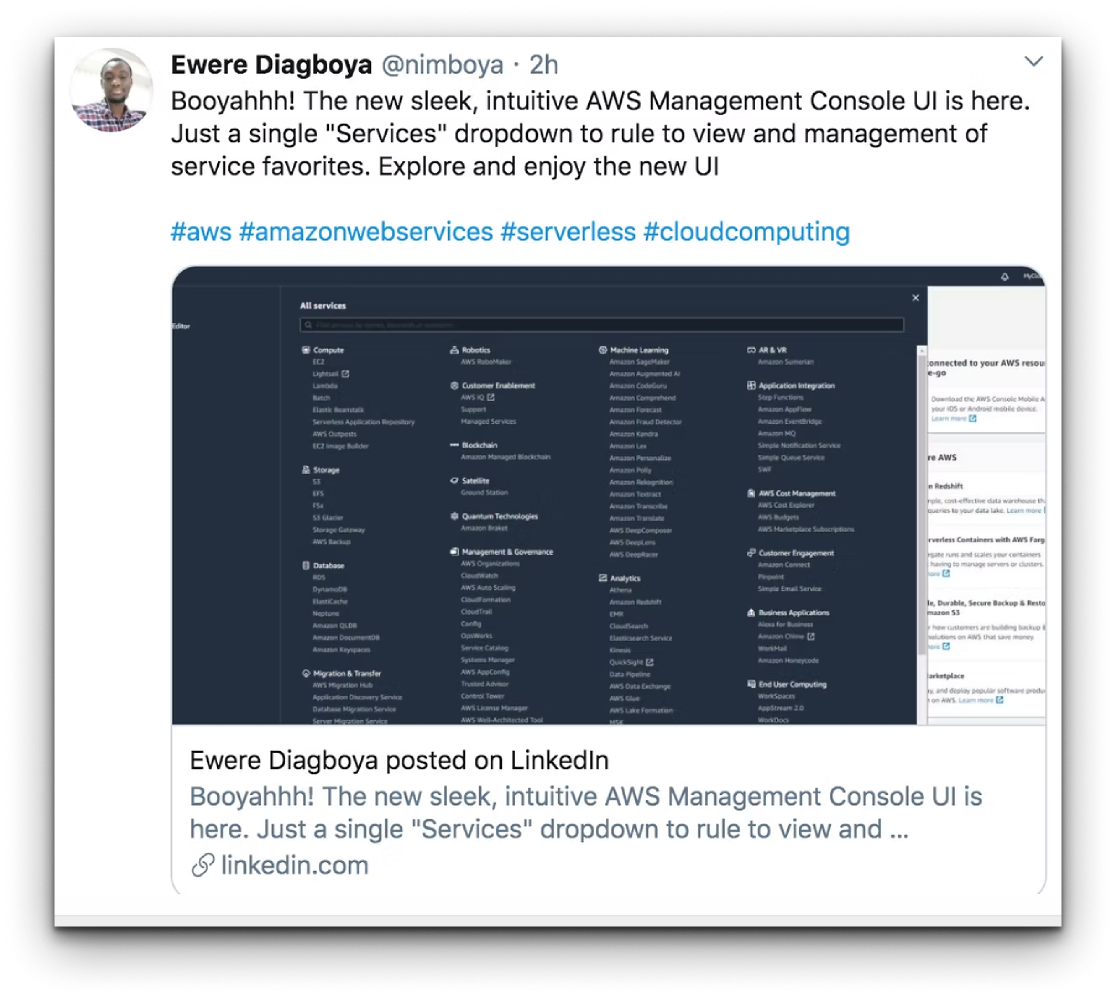
Quick Launch
The redesign landed well, and customers were quick to tell us what would make it even better: getting to their favorited services in one step instead of two. We turned that feedback around fast, shipping a follow-up revision that puts favorite services a single click away.