Program Dashboard
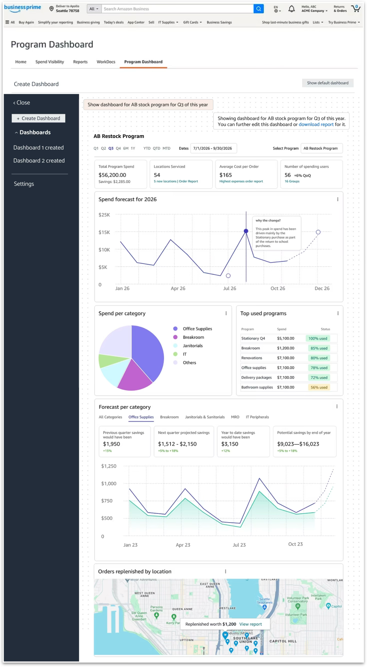
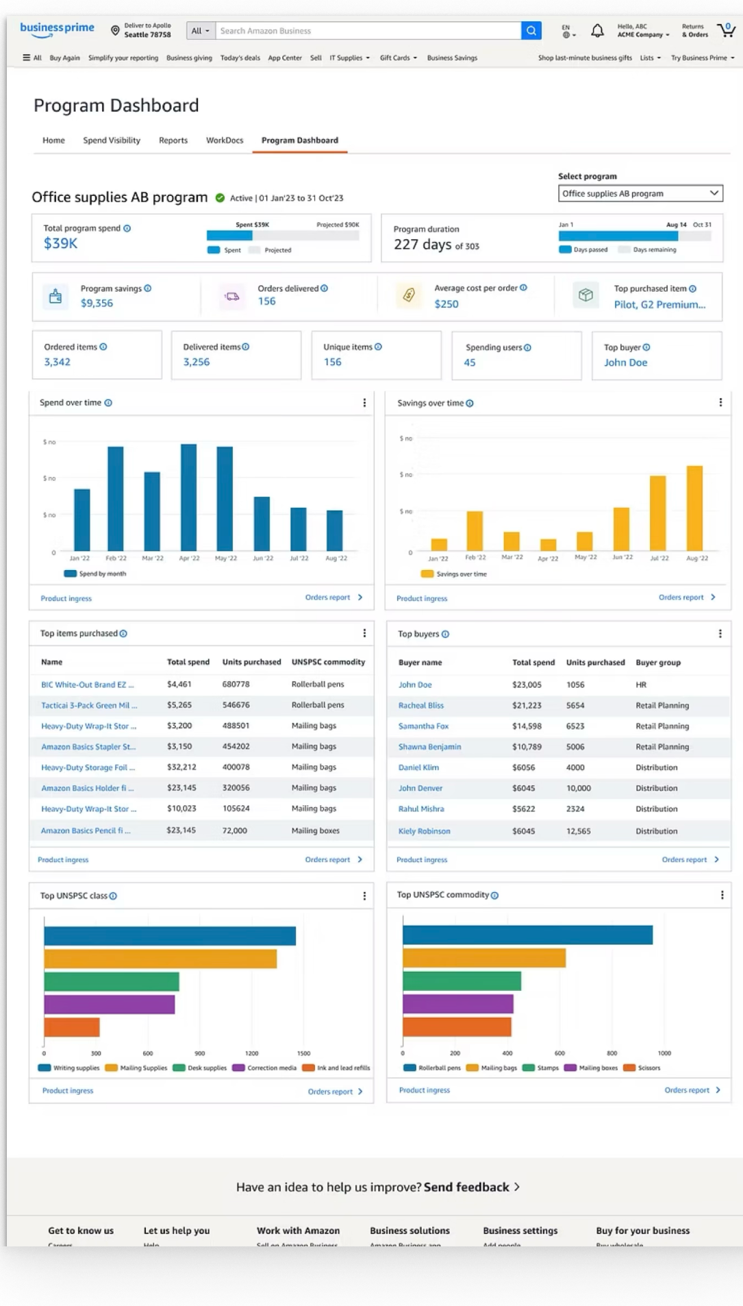
Consolidated 6+ fragmented procurement tools into a unified, single-pane-of-glass intelligence platform for Business Prime members — enabling $1.02B in managed spend visibility and cutting admin reporting overhead by 70%.
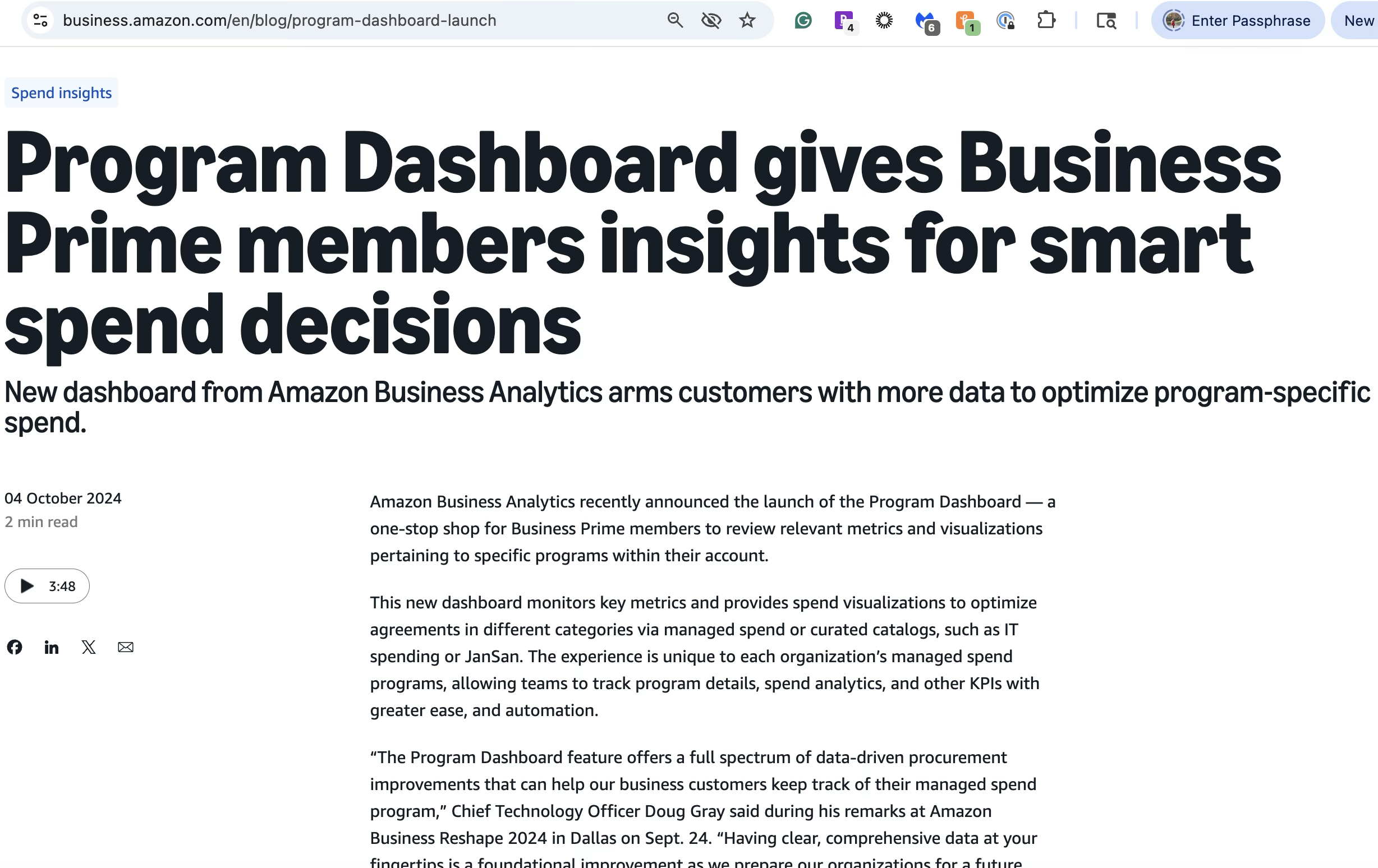
“Having clear, comprehensive data at your fingertips is a foundational improvement.”
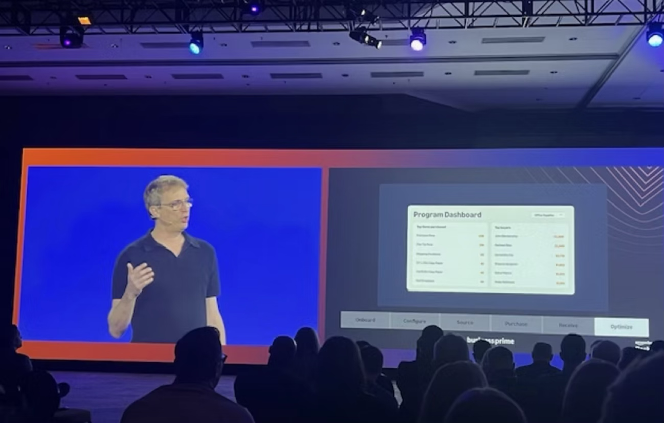
At Amazon Business, we found that customers had no visibility into individual procurement programs.
Finance and program teams were essentially flying blind when it came to justifying investment or spotting where to focus.
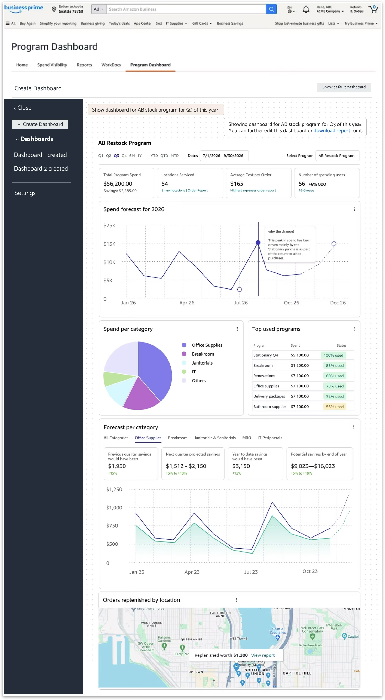
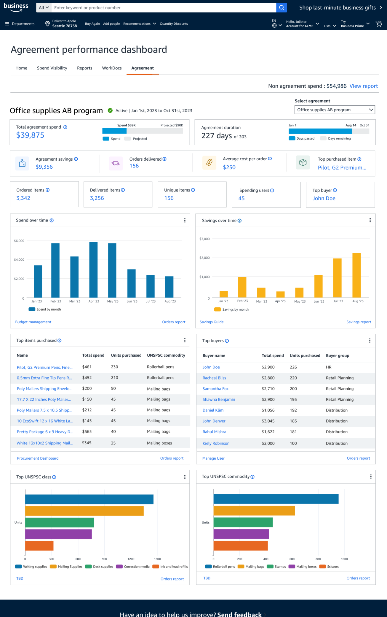
Design a ‘Dashboard', a first of its kind view into programs and managed spend across the organization.
Partnered directly with the Product Manager as well as Engineering stakeholders.
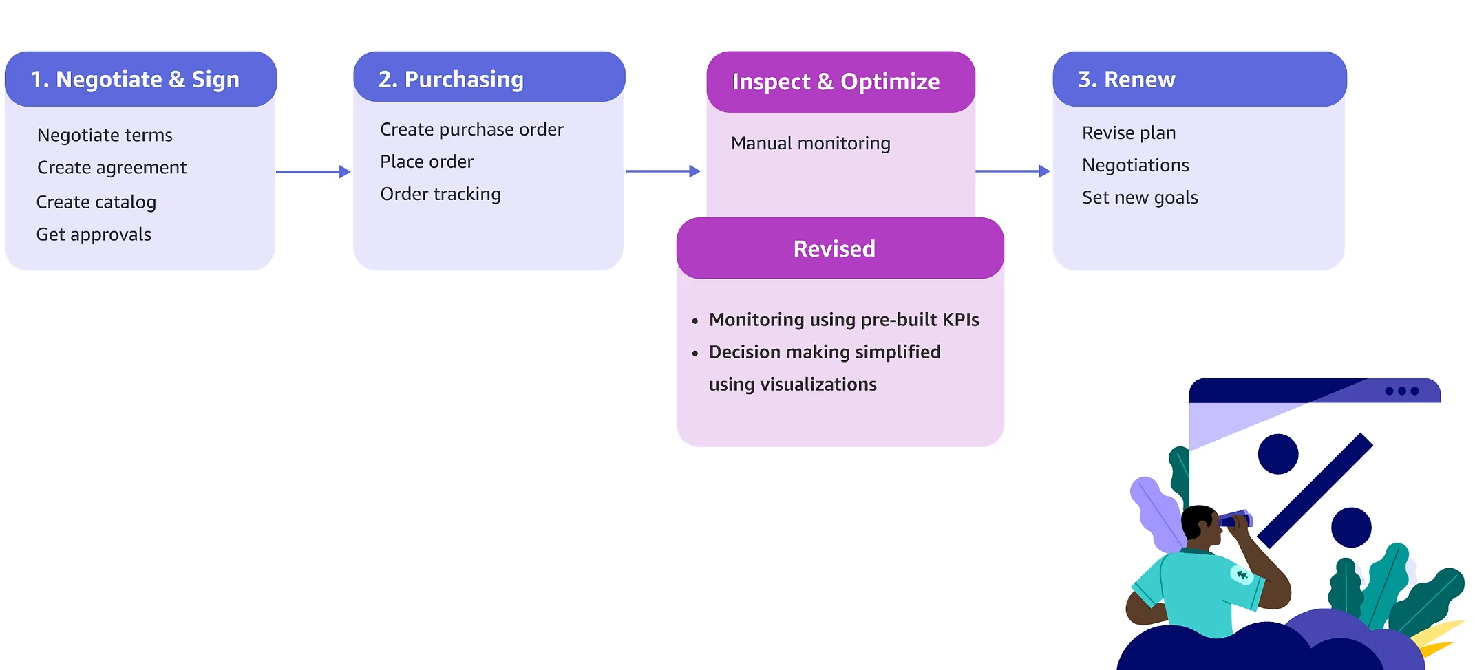
Understanding the lifecycle of programs
Mapping every stage a program moves through, end to end.
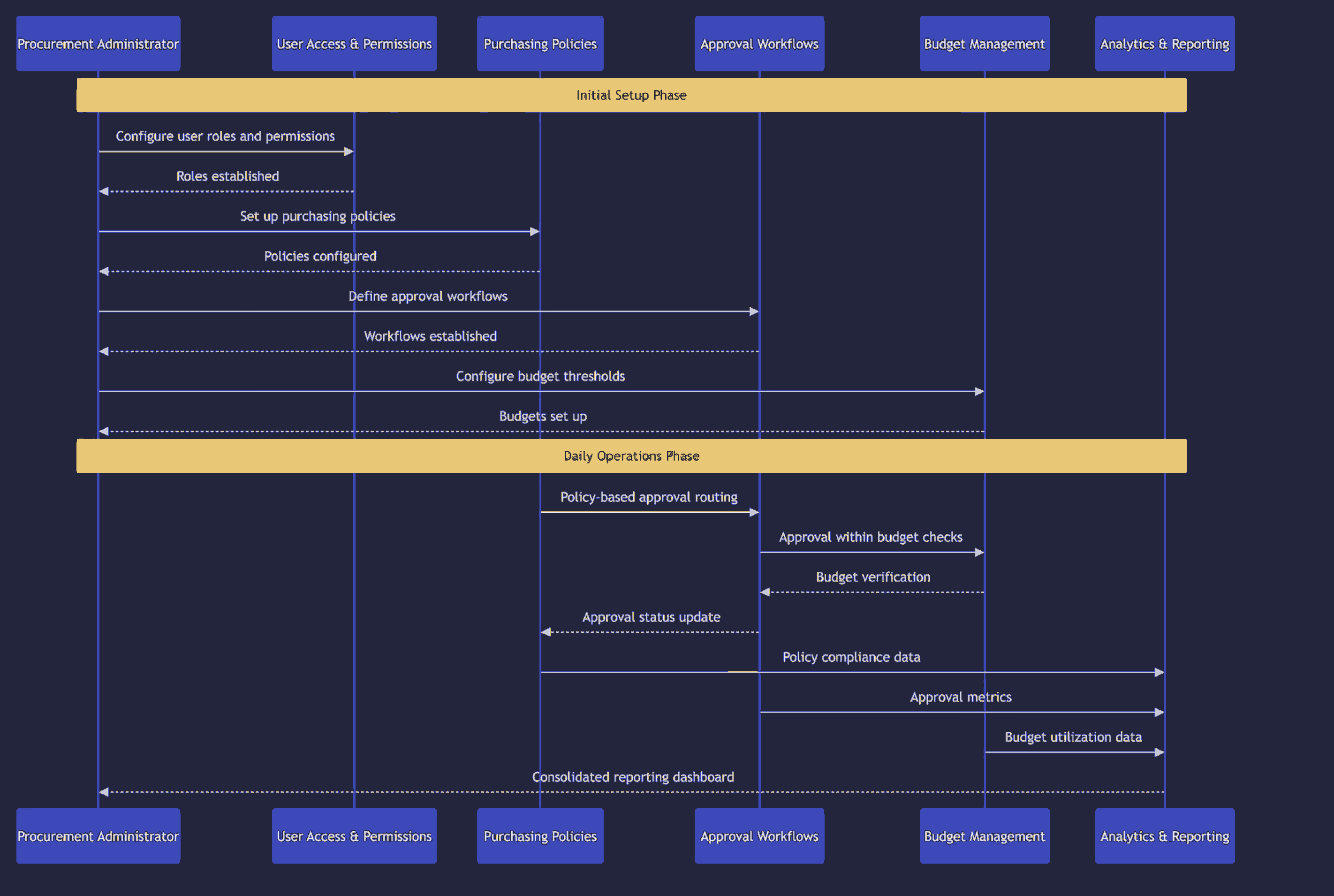
Simplified lifecycle of programs
Meet John
He is a senior procurement professional at a healthcare company who configures the entire procurement ecosystem. He is responsible for setting organization-wide policies and programs.

Partnered with Principal PM
Glimpse of FigJam
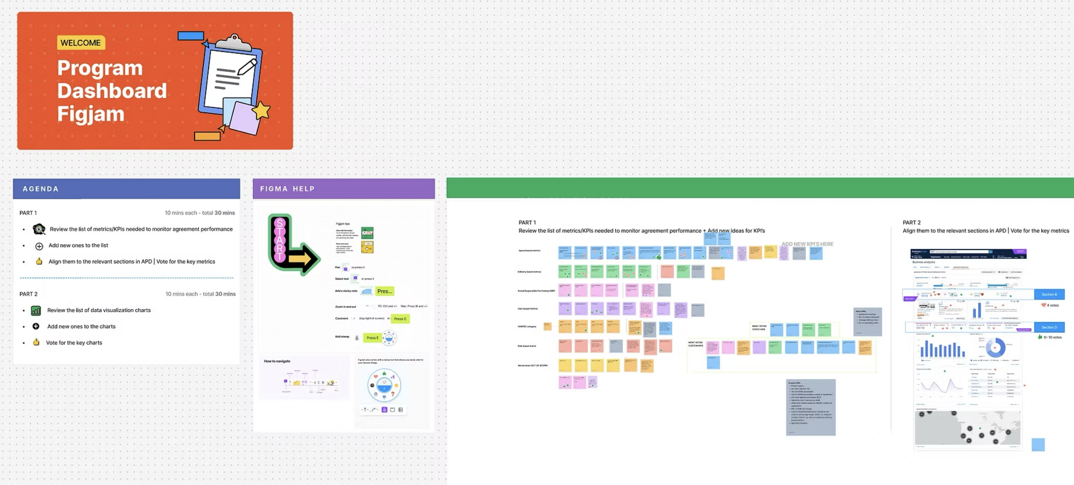
Eight candidate use cases surfaced in research, narrowed to the set for the first release.
Three key insights
Three pillars for the dashboard
These three pillars for the dashboard were inspired by the three insights stated above, based on our research findings.
Design Tenets
Every number on screen should point at a decision, not just a fact.
Design for both small and large scale procurement operations.
Present information with meaningful context that helps users make informed decisions.
Model for Program Adoption
One pillar at a time
Each pillar was explored independently before the pieces were assembled into a single view.
{{ pl.body }}
Click any frame to enlarge.
We performed usability testing for this experience with 12 existing Amazon Business customers and derived insights from them.
Usability study findings
Findings shared with cross-functional stakeholders.
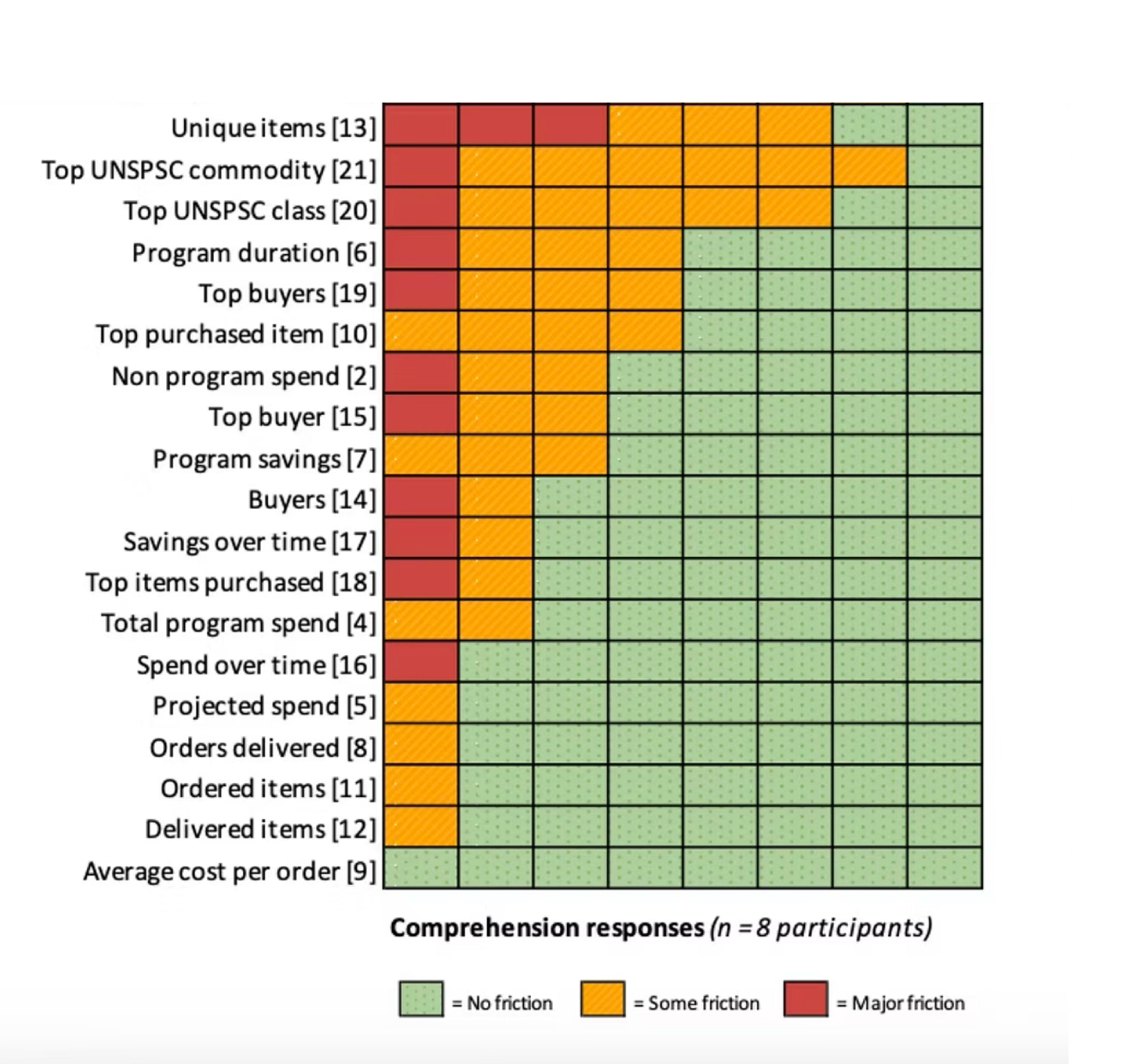
To build trust in our V1 dashboard, we closed the cognitive gap between enterprise metrics and user comprehension, ensuring our customers intuitively understood the exact same data definitions we used behind the scenes.
Overall findings
Revised UX design
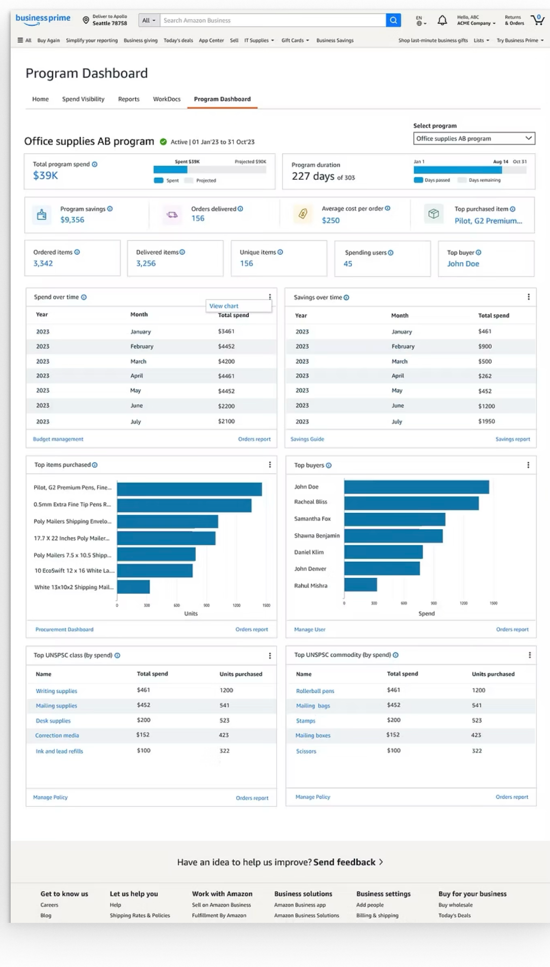
Participants asked for the same data in more than one form, so the final design pairs chart and table views of every widget. The dashboard was also renamed from “Agreement” to “Program” — customers consistently found the latter more relatable.
Vision | Customization
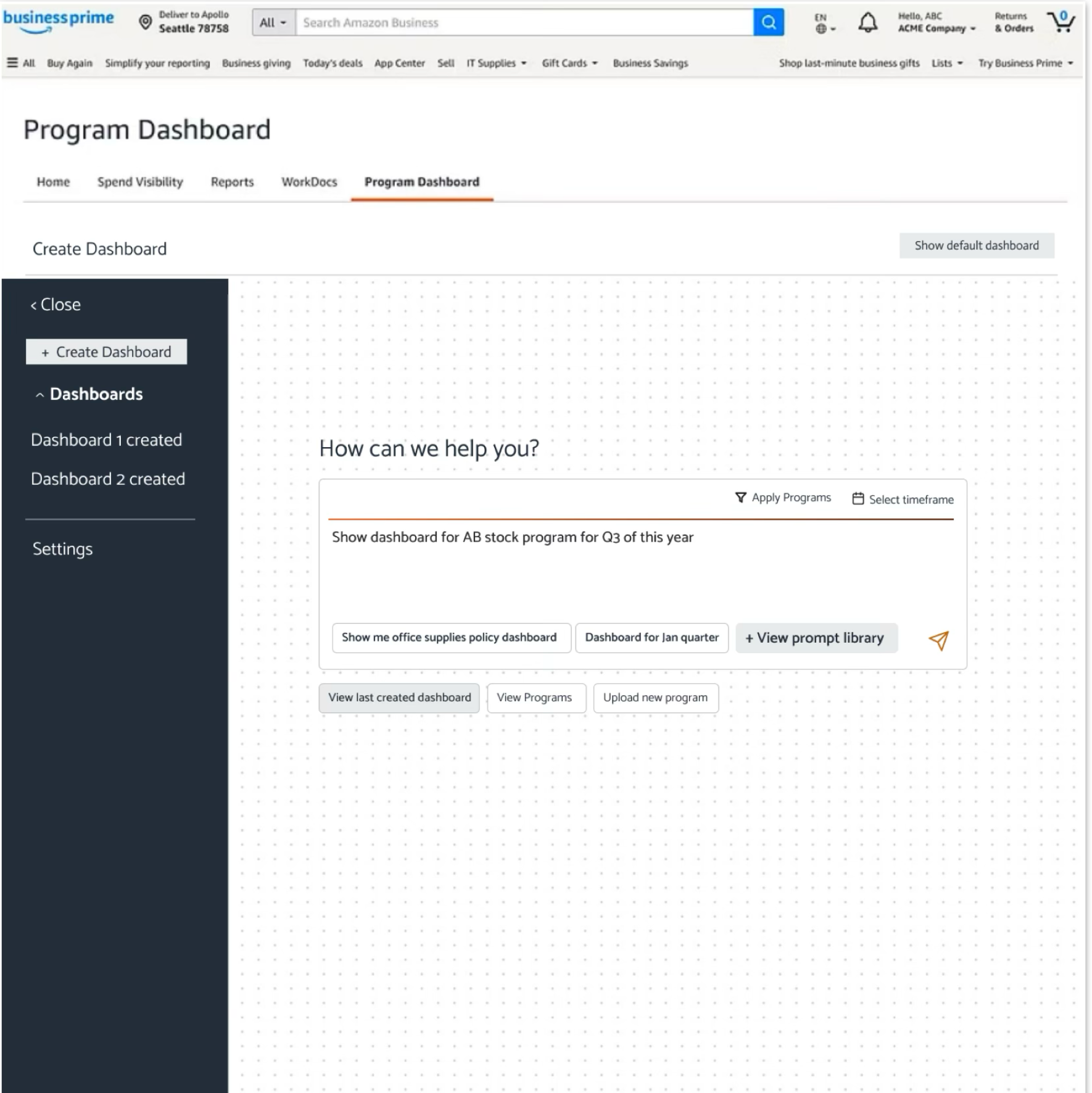
Designing how AI is surfaced will be just as critical as designing what it can do.


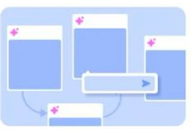
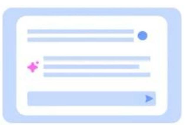


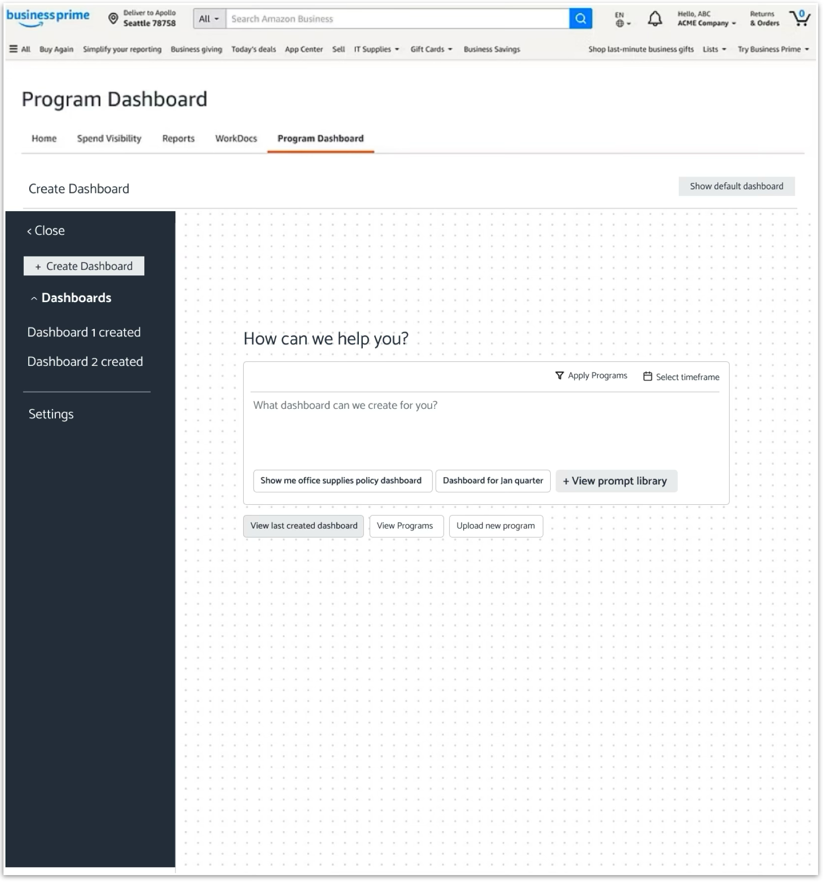
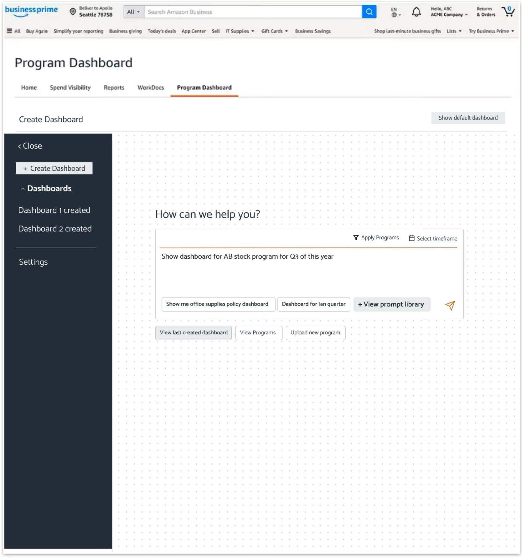
Explored different ideas of how AI would surface, and landed on the center stage approach because it:
-
01
Eliminates the “cold start” problem
Enterprise procurement tools often overwhelm users with dense navigation trees and complex query builders. A central conversational prompt gives users an immediate, clear entry point to start creating without prior training.
-
02
Sets clear intent for a natural-language UI
Treating the prompt card as the hero element signals that the system relies on natural language rather than manual drag-and-drop widget configuration.
-
03
Reduces cognitive load with guided discovery
Suggested prompt chips sit directly beneath the input, teaching users what they can ask — “Show me office supplies policy dashboard,” “Dashboard for Jan quarter” — and building the mental model of the AI while reducing friction.
-
04
Optimized for task-first workflows
For procurement admins who want to jump straight into generating insights, placing the creation bar center stage prioritizes task completion over browsing static content.
Instead of routing users through filters, menus, or navigation first, the natural-language prompt box dominates the initial viewport. Suggested AI actions and shortcut chips sit right underneath the input field, encouraging conversational engagement as the primary way to create content.