dP
Policy Adherence Dashboard
Amazon Business
Guided Buying Business Prime exclusive

Policy Adherence Dashboard

Comprehensive spend visibility and compliance monitoring for procurement professionals. The dashboard tracks key metrics and visualizes spend by policy.
{{ row.k }}
{{ row.v }}
Previous
The previous policy adherence view
Revised
{{ s.n }}
{{ s.t }}
Context

What is a Guided Buying policy?

Amazon Business policies are procurement governance tools that let organizations control, manage and optimize purchasing on the platform — a structured framework for directing spend toward preferred suppliers, enforcing compliance and achieving savings while keeping the right controls on the process.

{{ x.icon }}
{{ x.t }}
{{ x.lead }}
  • {{ p.t }}
Four configuration tools
{{ t.t }}
  • {{ p.t }}
Example: {{ t.ex }}
Who we designed for

Two primary users

{{ p.t }}

{{ p.b }}

The need

{{ p.need }}

Customer pain points
  • {{ p.t }}
Thoughts & feelings
“I need a better centralized way to monitor our procurement practices and policy compliance.”
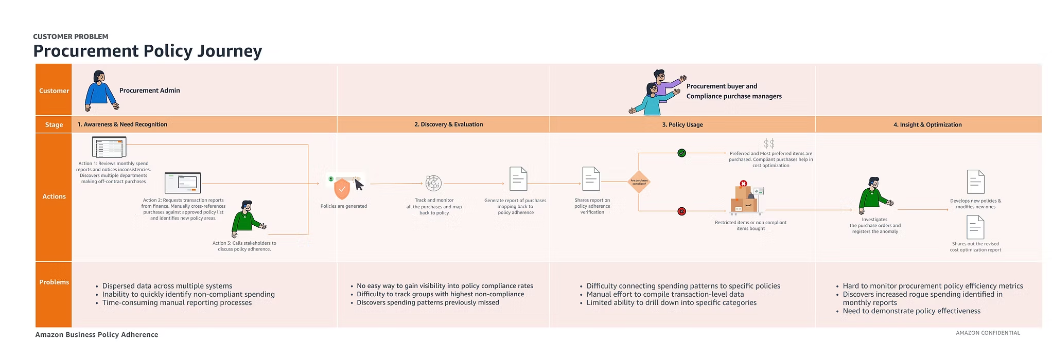
The journey today
Procurement policy journey across four stages — awareness and need recognition, discovery and evaluation, policy usage, and insight and optimization — mapping the admin's actions against the problems at each stage
Four stages, and the problems that surface in each
Deriving the use cases

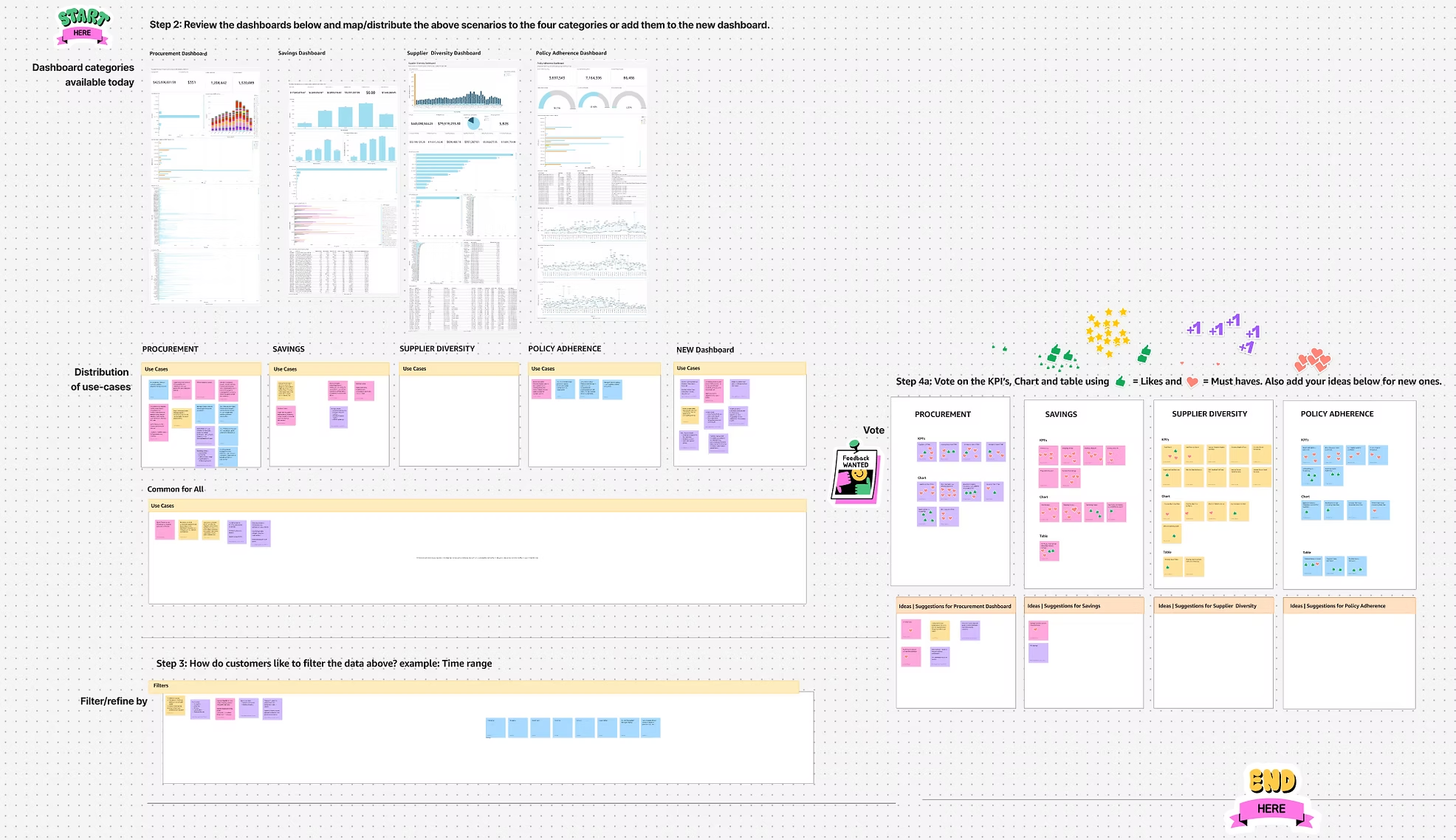
A two-hour workshop with 11 sales leaders

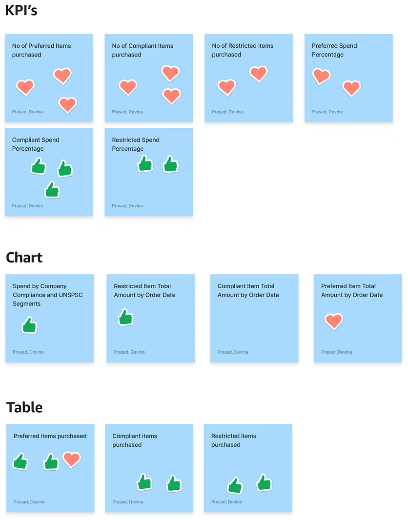
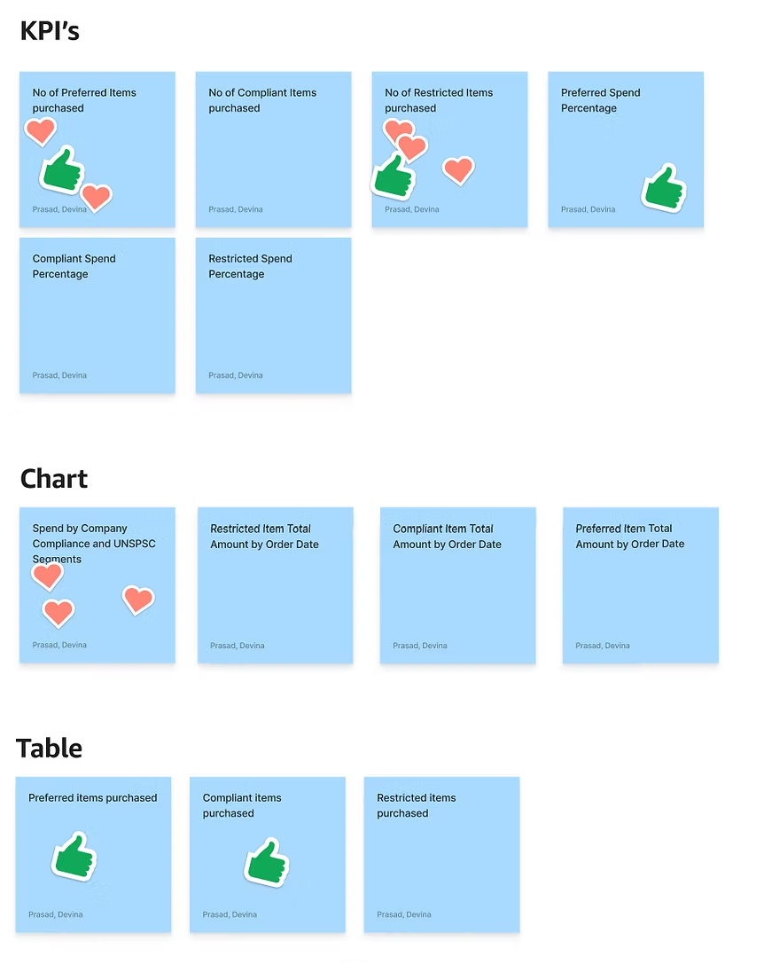
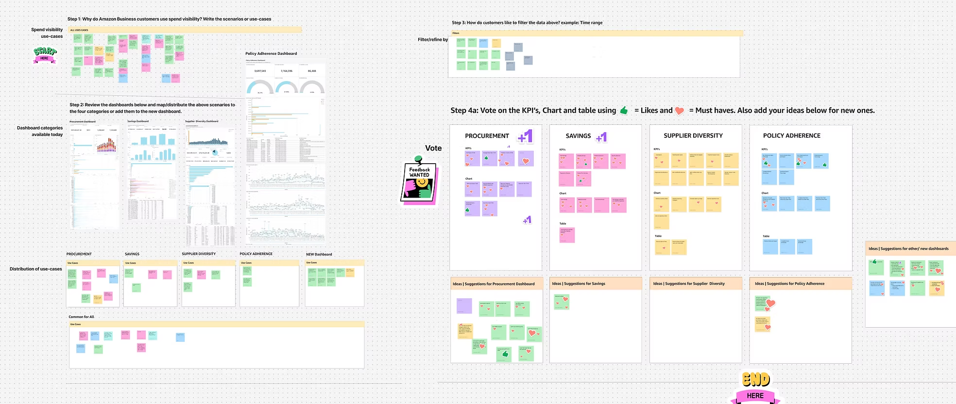
I spearheaded a strategic FigJam session alongside my Product Manager — one with US sales leaders, another with EU — bringing together leaders from every vertical to pinpoint needs across the program portfolio. We extracted the performance metrics, visualization priorities and business intelligence that matter to Amazon Business customers, then voted on the existing KPIs to see where the two regions agreed and diverged.
{{ w.n }}
{{ w.t }}
Session one — from use cases to KPI votes
The FigJam board: use-case capture, dashboard mapping, filter definition and KPI voting across procurement, savings, supplier diversity and policy adherence
Session two — mapping, filters and KPI voting
Second FigJam session: mapping scenarios onto the four existing dashboards, distributing use cases per category, defining filters, and voting on KPIs, charts and tables
US sales leaders — ❤️ must have, 👍 like
US vote tally on existing KPIs, charts and tables — hearts marking must-haves and thumbs marking likes
EU sales leaders — ❤️ must have, 👍 like
EU vote tally on existing KPIs, charts and tables — a different distribution of must-haves and likes to the US session
  1. Derived use cases Implementation ideas
  2. {{ u.n }} {{ u.t }} {{ u.idea }}
Framework adoption

A model for the policy dashboard

User-level policy customization feeds a governance framework of Most Preferred, Preferred and Restricted designations. The dashboard framework reads that configuration and resolves into a personalized dashboard — no two organizations see the same view.

Governance framework
{{ t.t }}
User level policy customization
Policy Dashboard framework
Outcome
Personalized dashboard

Design tenets

Three principles that governed every decision, from chart selection to how the data announces its own limits.

{{ t.n }}
{{ t.t }}

{{ t.b }}

UX explorations

Five passes at the same dashboard

Each pass moved more of the compliance story above the fold: filters and active-filter chips, KPI grouping, then policy spend detail and trend over time.
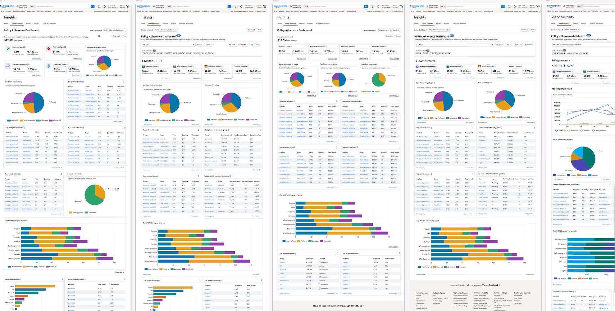
Five successive dashboard explorations, from the first policy adherence layout through filter chips, KPI regrouping, policy spend detail and a spend trend view
Five explorations, left to right — click to open full size
Prototype

The dashboard in motion

The clickable prototype taken into usability testing — filtering, drilling into a policy group, and moving from a compliance signal to the orders behind it.
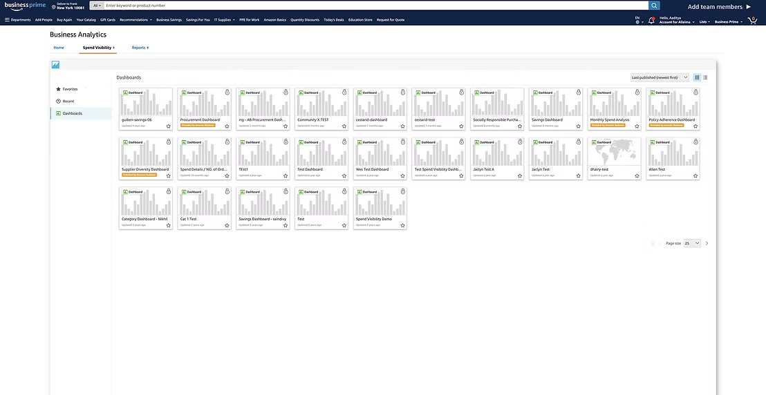
Previous main policy page
The Business Analytics dashboards list in Amazon Business Prime, showing the existing Policy Adherence and Procurement dashboards
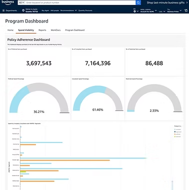
Previous policy dashboard
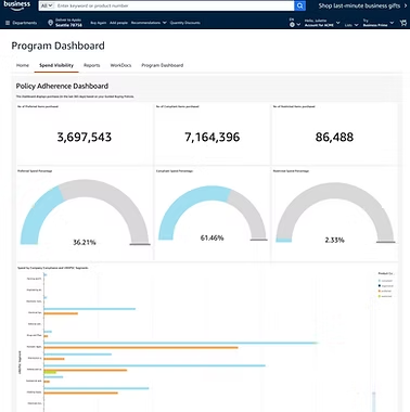
The previous Policy Adherence dashboard inside the Program Dashboard tab
Revised prototype
0:00
Dashboard impact

From firefighting to foresight

Five shifts in how procurement teams work, and the UX consequence of each.

  1. {{ s.k }}

    {{ s.b }}

    UX impact

    {{ s.u }}

Designs delivered + launched

UX launched

The activity summary leads with total spend and the four policy tiers, then policy spend detail below. Every widget carries both a chart and a table view, and the filter bar is stateful, so a view can be narrowed and read back.
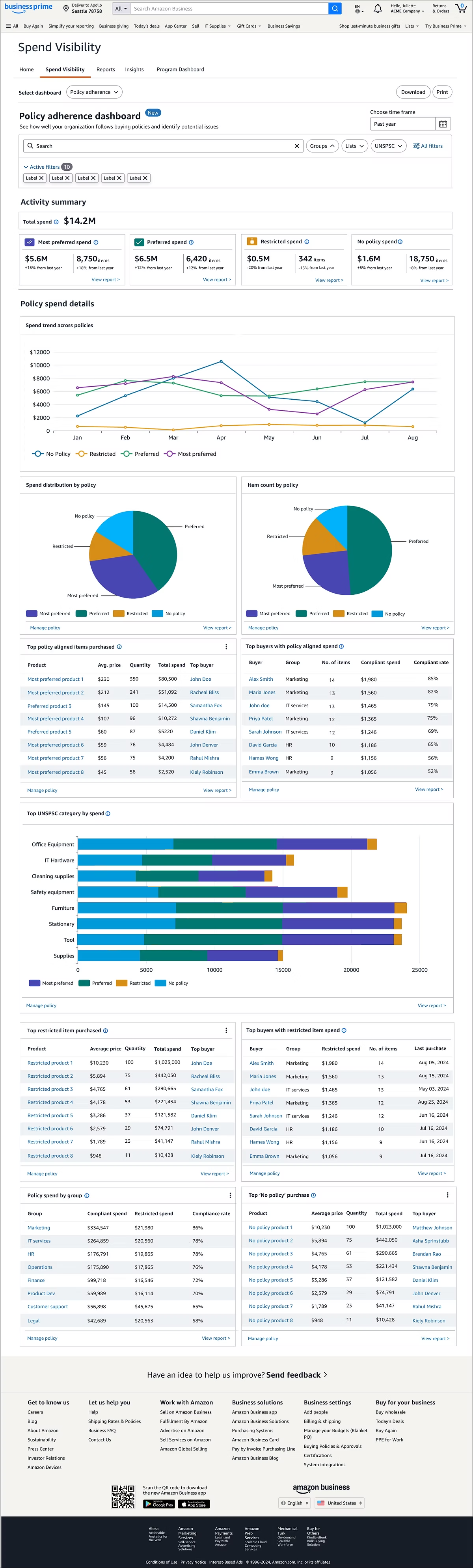
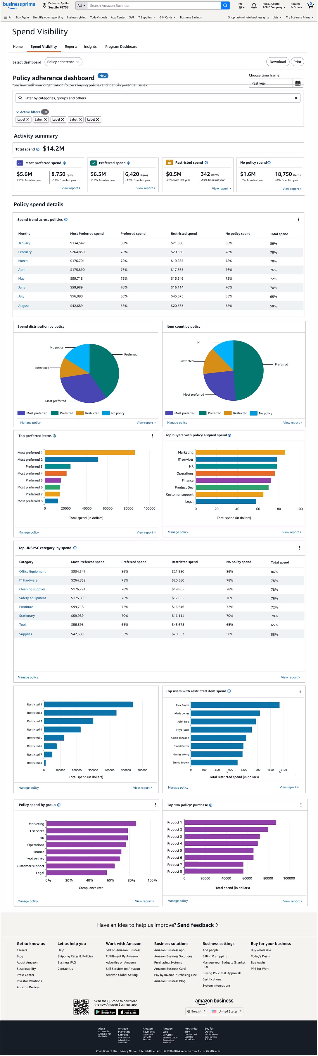
Chart view
The launched policy adherence dashboard in chart view — activity summary, spend trend across policies, distribution and item count pies, and top items and buyers tables
Table view
The same dashboard in table view — spend trend and UNSPSC category as tables, with bar charts for top preferred items, buyers, restricted spend and policy spend by group
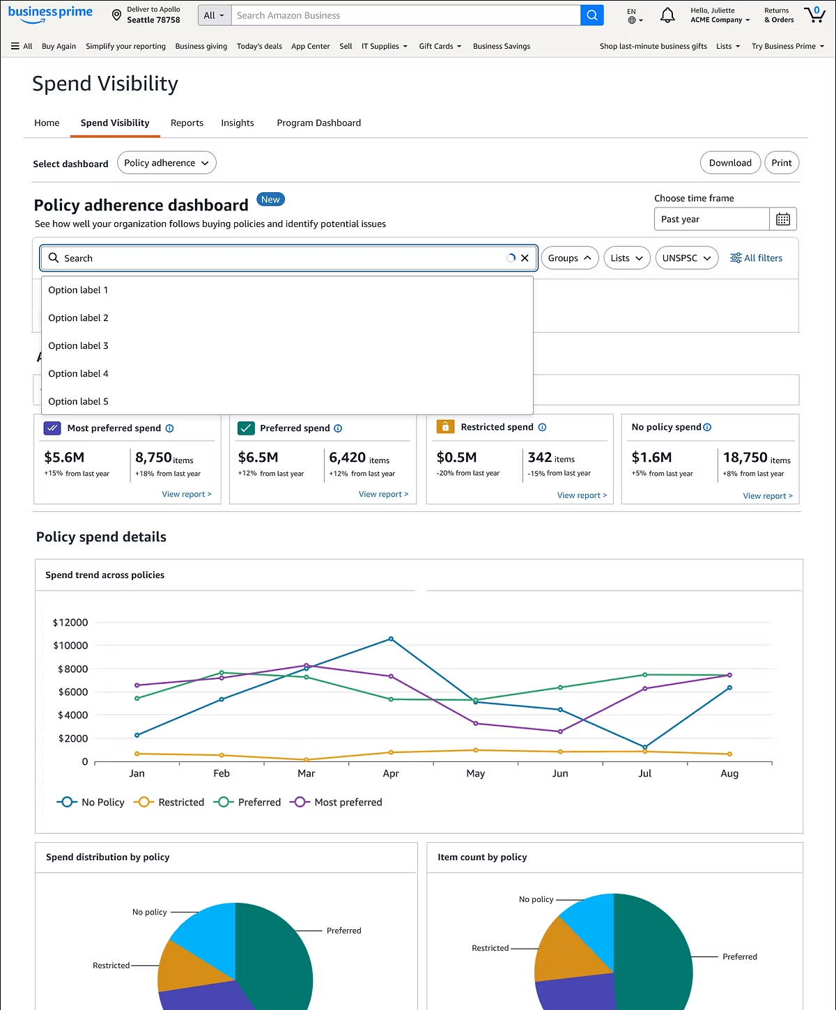
Search suggestions
The search field open, offering typeahead option labels above the activity summary
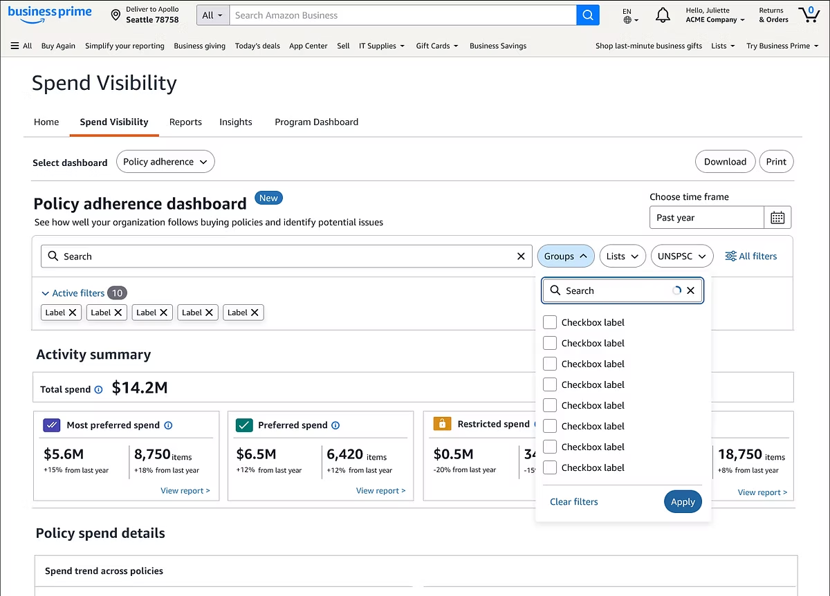
Group filters
The Groups filter open, with a searchable checkbox list plus Clear filters and Apply actions, and ten active filter chips shown below the search bar
Review with dev team

Reviewing the build in the browser

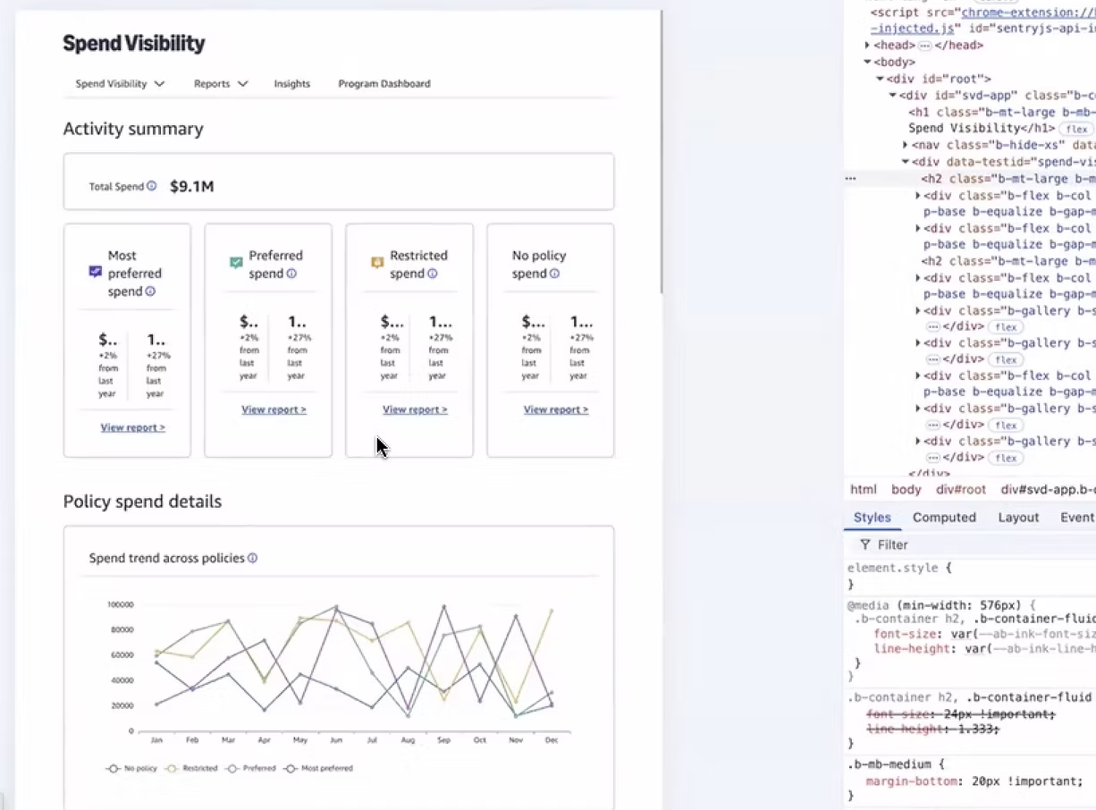
Walked the running build with engineering in dev tools, checking each widget against the spec: heading sizes and margins overriding the design system, cards collapsing at narrow breakpoints, and chart tooltips reporting the right values per policy tier.
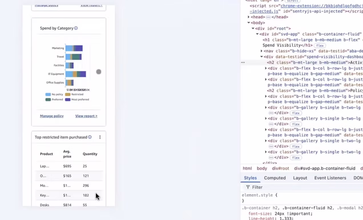
Narrow breakpoint
Dev tools inspecting the dashboard at a narrow width, where Spend by Category and the restricted items table stack into a single column
Type and spacing overrides
Dev tools showing heading font-size and margin declarations being overridden, with the activity summary cards wrapping their labels
Tooltip values in the running build
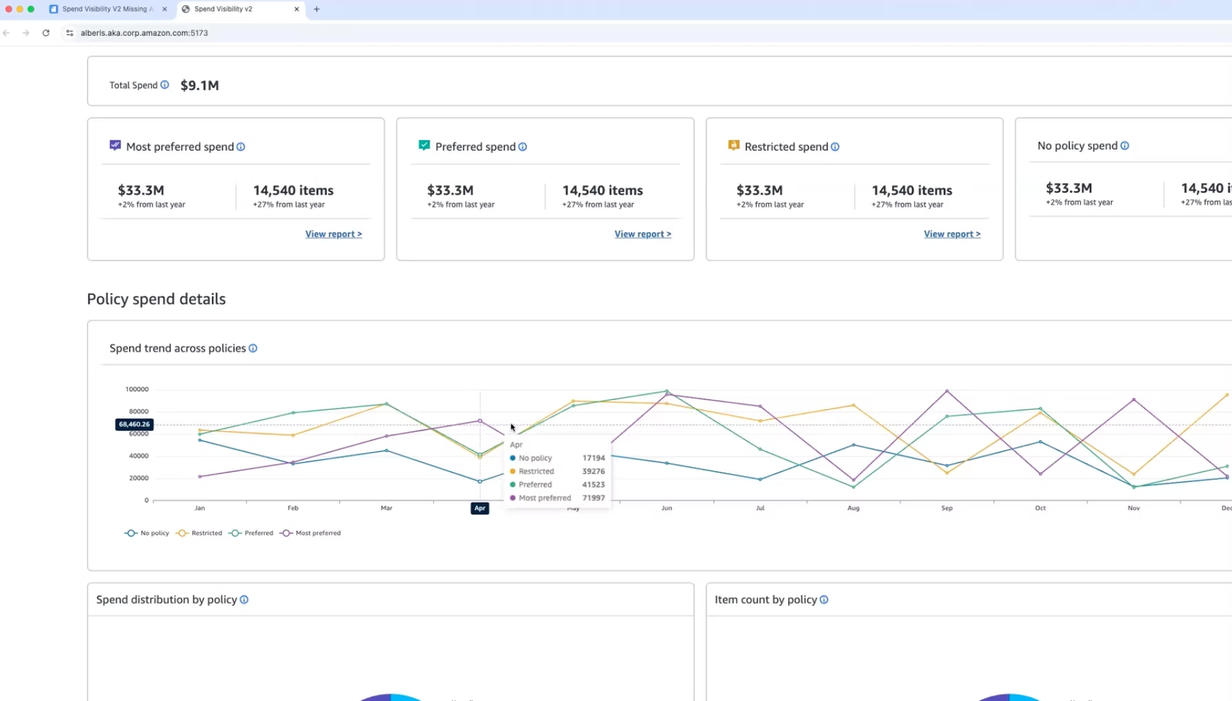
The running build at full width, with the spend trend tooltip reporting no policy, restricted, preferred and most preferred values for April
Final walkthrough

The shipped experience

Before and after

The Operations Manager's week, rewritten

The clearest measure of the redesign is what happens to the rhythm of the job — daily, weekly, monthly, quarterly.

{{ r.k }}
Before
  • {{ b.t }}
With the dashboard
  • {{ a.t }}
Success metrics

A UX Success Scorecard

Using AI prompts I built a scorecard to track these metrics quarterly, aligning UX design performance directly with the business goals we had identified.

{{ h.t }}
{{ r.m }}
{{ r.d }}
{{ r.s }}
{{ r.g }}